There’s a wave of positivity, fun and risk-taking emerging across the globe. It’s a far cry from the restrained, minimalist aesthetic, writes Clare Dowdy.
T
Things are brightening in the design industry. Across the world, creatives are making a splash with bold colours and pattern. These polychrome interiors, installations and murals are a far cry from the restrained, minimalist aesthetic that has dominated in some countries in recent times.
More like this:
– Why glamorous glassware is booming
– What you didn’t know about colour
– Design’s new stone age is here
In Sydney, Australia, architects Amber Road and colour consultants Lymesmith have used so many joyful hues in the reworking of a 1960s dwelling that it’s been renamed Polychrome House. Their aim was to give the house – whose previous interiors were as brown and characterless as the exterior – an “energetic feel”, according to the architects.
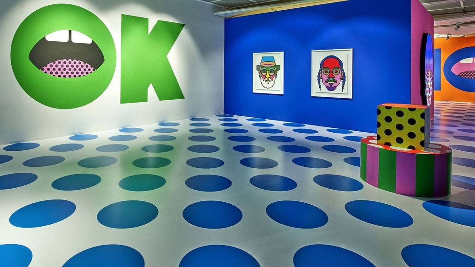
Craig & Karl, who are New York and London based, showed their bold graphic works at a recent exhibition in Seoul called All In (Credit: Craig & Karl)
Meanwhile, architects Azab in Spain introduced an ice-cream-pink kitchen, cherry-red sliding doors, a carpet in bright abstracts, and an orange and green corridor to a Bilbao apartment. The reason: to shake off the owner’s sense that Mixtape Apartment had become boring, inspiring merely a “blurred and greyish mood”.
And at her Massachusetts home, architect Deborah Richards has added bright yellow to the windows and doors, which contrast to the exterior’s demur shingle cladding.
Outside of the home, designers are making colour work hard in more conceptual pieces. In Tokyo, Spread design duo have created Life Stripe, a project that records a person’s activities during one day along the axis of time, with colour-coded bands. And the firm’s award-winning Haru Stuck-on project is another recent work to gain attention. Meanwhile, Craig Redman and Karl Maier (aka Craig & Karl) live in New York and London respectively. They presented their signature bold colours, graphic patterns and geometric shapes for a recent exhibition called All In at Seoul’s Avenue L.
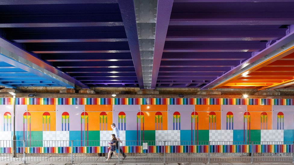
Yinka Ilori’s Happy Street permanent installation has transformed a London railway bridge (Credit: Luke O’Donovan)
Of course, many places, from India and Africa to the Far East, have ebullient colours and pattern in their DNA, and have never fallen out of love with colour. British-Nigerian designer Yinka Ilori makes trips from his London home to get inspiration from the traditional fabric stalls of Lagos’s Balogun Market.
For other places, the current use of colour is driven by their contemporary design industries. London has an unusually high concentration of designers using bold colour and geometric patterns, and is being driven by a diverse cohort of increasingly influential creatives. Designer Adam Nathaniel Furman has dubbed this phenomenon ‘New London Fabulous’, and includes Ilori, Camille Walala and Morag Myerscough (who are all based in the city) as its champions.
He defined it in Dezeen as “design and architecture as a visual and cultural pursuit, which is a highly aesthetic, sensual and celebratory of mixed cultures”.
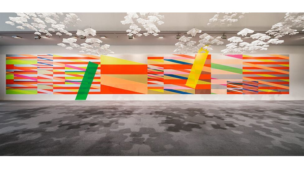
The Tokyo-based firm Spread created the award-winning Haru Stuck-on Design project (Credit: Spread)
Diversity, timing and a change of heart from the design world are all factors in the new aesthetic, according to Furman. “A more diverse range of people are entering design and culture,” He tells BBC Designed. Furman is of Argentine, Japanese and Israeli heritage. And then in the early 2000s, there was “the incredible influx of Europeans”, which gave the city an injection of what Furman calls ‘mixiness’ or non-political pluralism. (Space Popular’s founders are Spanish and Swedish, Walala is French and Lothar Gotz is German).
The bright stuff
As the UK capital’s creatives became more diverse, there was a simultaneous explosion in its design economy, with pavilions and pop-ups being commissioned for the myriad public events and festivals. Couple all that with the subsequent boom in social media, and it’s no wonder that these temporary murals, playgrounds and the like have grabbed people’s attention.
The modus operandi of these designers and architects tends to feature big, geometric shapes in strong colours, sometimes alongside pastels, with black – which London-based practitioner Camille Walala uses “to make the colours pop” – and even neon thrown in.
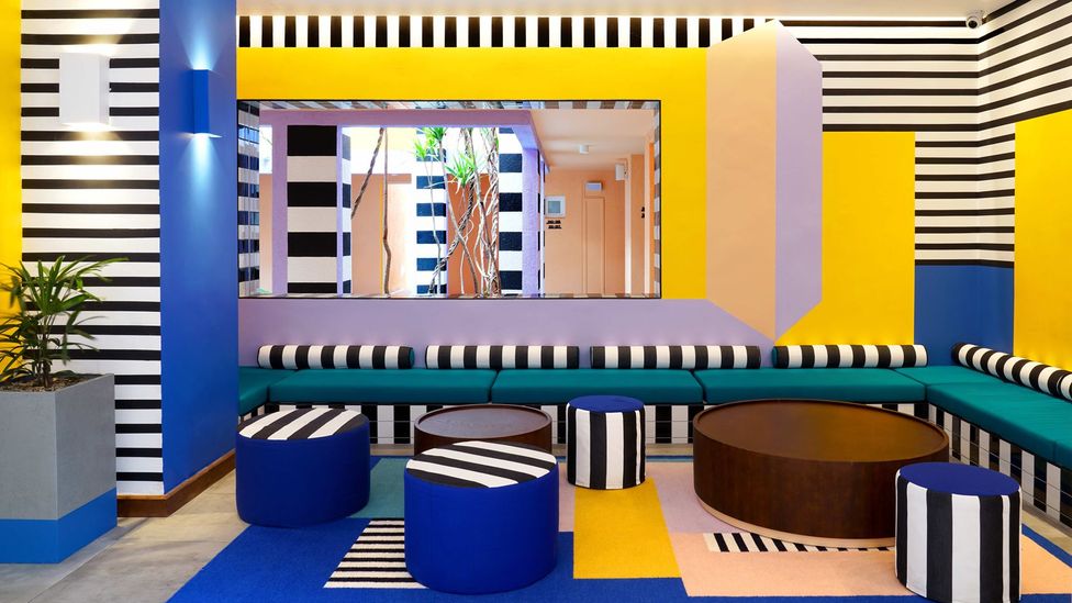
Camille Walala creates geometric interiors, such as this one at the Salt of Palmar hotel, Mauritius (Credit: Tekla Evelina Severin)
Hence Furman’s ceramic Gateways installation and Ilori’s railway underpass mural – both in London. And these practitioners’ work pops up elsewhere. Myerscough, who has made structural projects around the world, is now creating an interactive superstructure with partner Luke Morgan for AfrikaBurn’s 2021 festival in South Africa, and has an upcoming spire sculpture in Paris; Walala’s boutique at the Salt of Palmar hotel is in Mauritius; Ilori has just added colour to a new indoor skate park in Lille; and Gotz’s mural has transformed Eastbourne’s Towner gallery. “We’re a loud minority in the design world, and have had to find our own career path,” Furman says.
While many of these Londoners started making their mark in the last decade, Myerscough has been honing her trademark style for more than 30 years. Furman acknowledges the huge influence she has had on the younger generation. She claims that when she started, there was “no colour because the whole world had been built by men”. For many years, she was ploughing a lonely furrow with her bold type, 3-D graphics and outlandish colour combinations. “I find colour is uplifting and joyful,” she says, but admits that there’s still the perception that colour is unsophisticated.
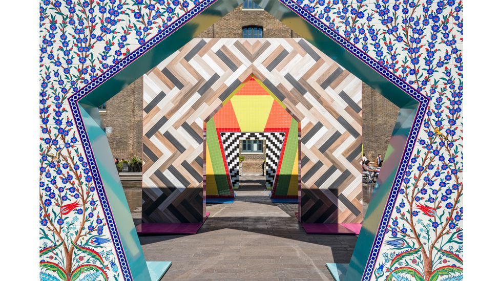
Gateways, an installation by Adam Nathaniel Furman, is inspired by diverse influences, including Turkish ceramics (Credit: Gareth Gardner)
That view is starting to change. Furman’s Saturated Space research group, which he set up at the Architectural Association nine years ago, explores the role that colour can have in cities and spaces, whereas “before, colour was discussed in faddish interior design way,” he says.
While it may look like child’s play, these evangelists take colour seriously. On her travels, Walala picks up paint samples from hardware stores, and mixes colours in her sketch book. Meanwhile, Haruna Yamada and Hirokazu Kobayashi of Spread record the combinations of colours they come across around the world. “We usually bring Pantone and other colour charts with us on our trips,” says Yamada, “the weight of these charts alone can become 5kg of luggage.”
So engrossed are they in their own colourful worlds, that for the most part, trends and fads pass them by. However, Lara Lesmes of London duo Space Popular believes that “a strong colour palette creates a strong expression and identity, and will be associated with an attitude and a time”. The duo’s carpet for their exhibition Freestyle at London’s RIBA earlier this year, exemplified this. Models of London buildings sat on a polychromatic carpet which charted architectural styles through the ages. “The colour is purely information,” she adds.
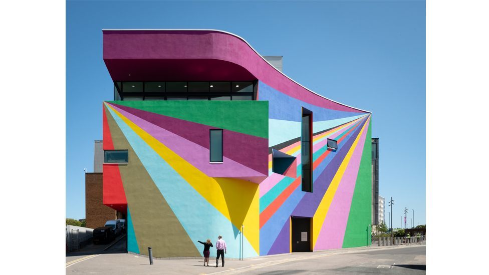
Design duo Space Popular’s mural has transformed the Towner gallery in Eastbourne, UK (Credit: Jim Stephenson)
These designers know how to make big, outdoor pieces of public art sing. But as Azab in Spain and Amber Road in Australia would agree, moving strong colours indoors is tricky. “With exteriors, you have a level of detachment, they won’t affect you in the same way as an interior,” says Myerscough. She cautions that “colour can affect mood a lot.” Years ago, she learnt this the hard way, when she painted her bedroom what she thought would be a warm red. “I thought I was inside my own stomach,” she says of the result.
On a client’s recent house project, Lesmes took no such chances. She limited the palette to white paint, timber and brick, “and we’ve introduced green,” to work with the house plants.
Since the red bedroom debacle, Myerscough’s own house had been white – until she picked up a paint brush in lock-down. Now, to describe it as a riot of colour is an understatement. “It’s very complex (to add colour to) a space you’re in all the time,” she admits.
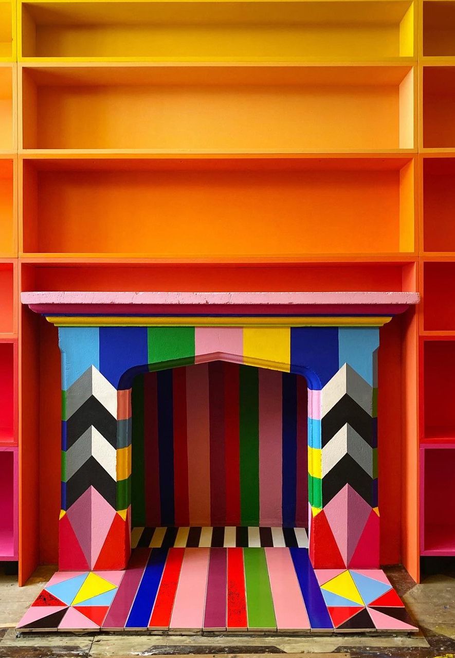
The designer Morag Myerscough’s has been honing her trademark style for 30 years (Credit: Morag Myerscough)
Despite this complexity, Furman applauds bright interiors. “It’s about taking risks and having fun. I hate it when homes are done up as assets, to be inoffensive. Why be alive?”
To this end, perhaps, Ilori is soon to launch a paint range with Simon March, owner of paint business Colour Makes People Happy.
Of course, this is not the first time that colour has been embraced by the design scene. Colour theory was taught at the Bauhaus by Paul Klee, Wassily Kandinsky and others, and expertly executed by Josef Albers. Pritzker Prize-winner Luis Barragan gave Mexico’s colour schemes a modernist twist, influencing contemporary projects such as the Hotel Camino Real in Polanco, Mexico City, by Ricardo Legorreta. And later Ettore Sottsass’s 1980s Memphis movement was known for its bold colours and graphic patterns – epitomised by the iconic Carlton room divider. Nor is this a backlash to minimalism, claims Furman, but rather an additional aesthetic that can happily sit alongside it.
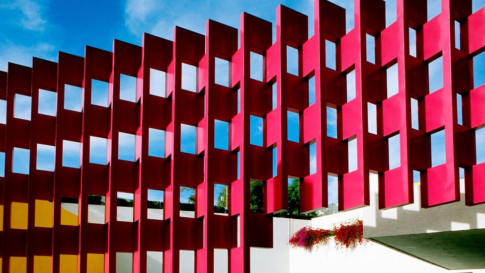
Ricardo Legoretta’s recent design of Hotel Camino Real, Mexico, was influenced by the work of Luis Barragan (Credit: Alamy)
Despite the increase in these vibrant commissions, Walala doesn’t understand why there isn’t yet more colour out there. She made a splash on London’s Old Street five years ago, by painting a dark, unexceptional building with contrasting geometric patterns. “Everything else around was grey, and when the weather was grey it made the colours pop even more,” she says. “My purpose in life is to bring joy to people, through pattern and colour on their way to work, to make them smile. They need it.”
If you would like to comment on this story or anything else you have seen on BBC Culture, head over to our Facebook page or message us on Twitter.
And if you liked this story, sign up for the weekly bbc.com features newsletter, called The Essential List. A handpicked selection of stories from BBC Future, Culture, Worklife and Travel, delivered to your inbox every Friday.
